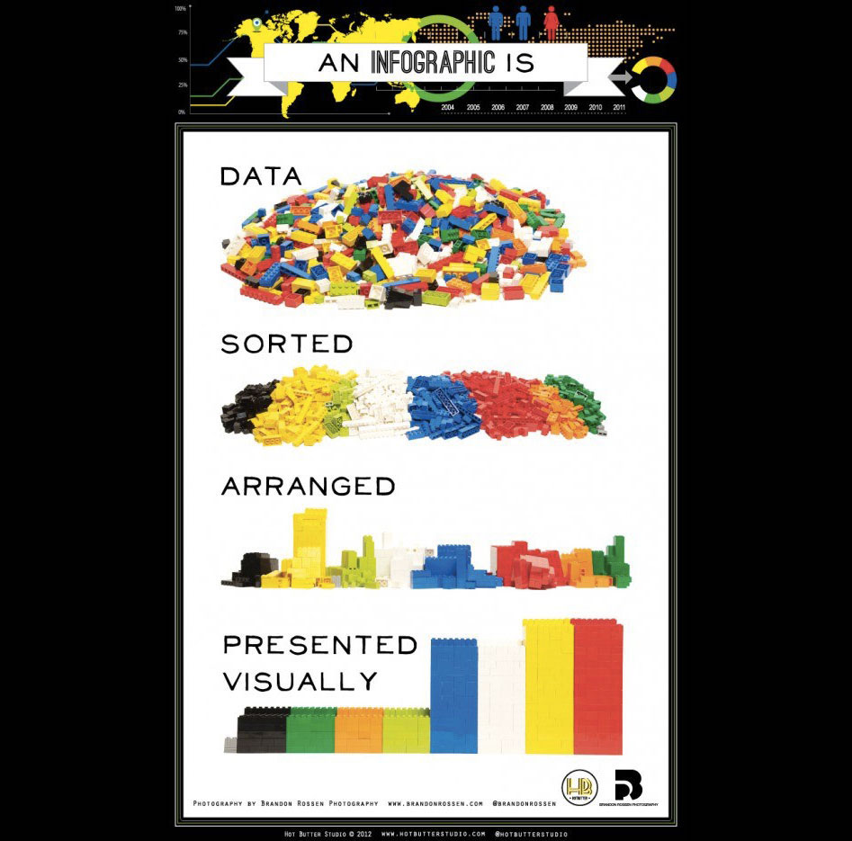
Visualization:
Free and open source options for communicating data
Poppy Riddle
- PhD candidate
- scholarly communications
- art and design
What’s wrong with Excel?
Both Excel and Tableau are great for exploration and presentation of data.
Its very recognizable.
Its both the tool and the viewer.
OtherLevels: https://www.youtube.com/@OtherLevels
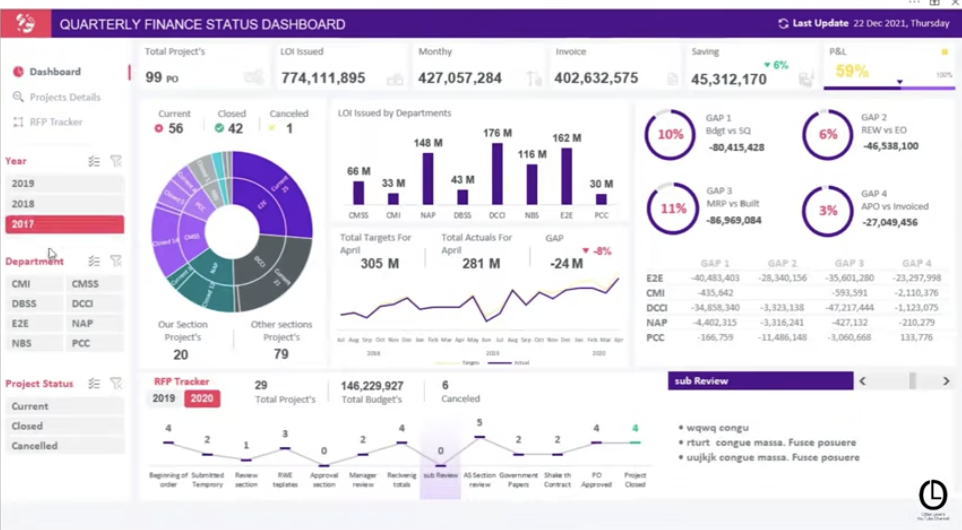
But, its not uncommon to see it in greyscale:
So, how can we make this a little more enticing?

Scale
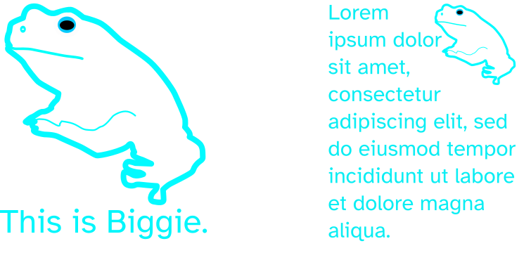
Scale affects how big or small your visualization can still be legible.
![]()
Or…
You may need to move things around a bit.
Color
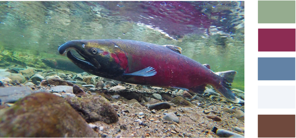
Here are some resources:
For scientific publications: http://vrl.cs.brown.edu/color

Super easy and beautiful color palettes: https://color.adobe.com/create/color-wheel

So many more: https://sites.google.com/view/visres/special-topic-color/noteworthy-and-popular-color-resources?authuser=0
Line
Line weight helps to separate and define.
How does this look big? Or small?
Is it near or far?


So, you might adjust depending on your needs:
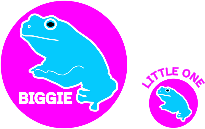
Shape
What do these shapes mean?
How might they be interpreted in the context of the narrative?
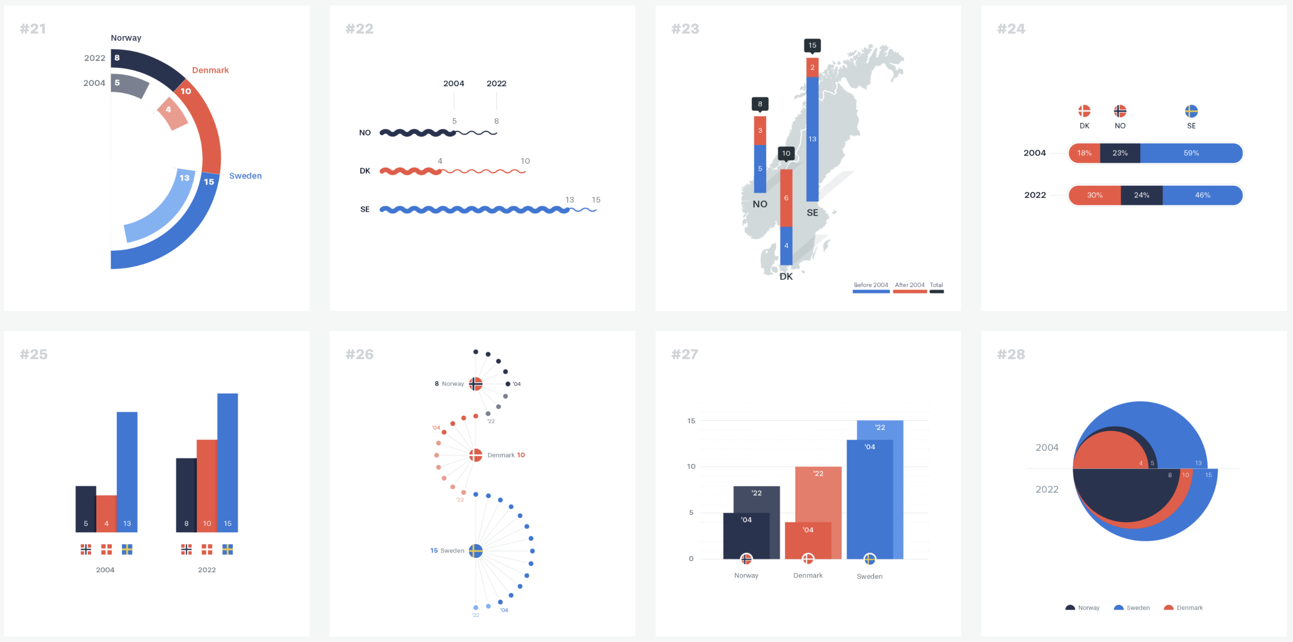
See Ferdio’s 100 visualizations with just 6 data points. https://100.datavizproject.com/#

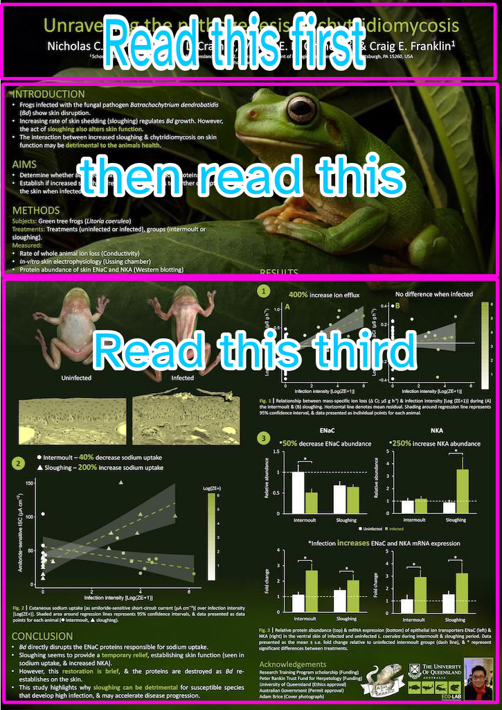
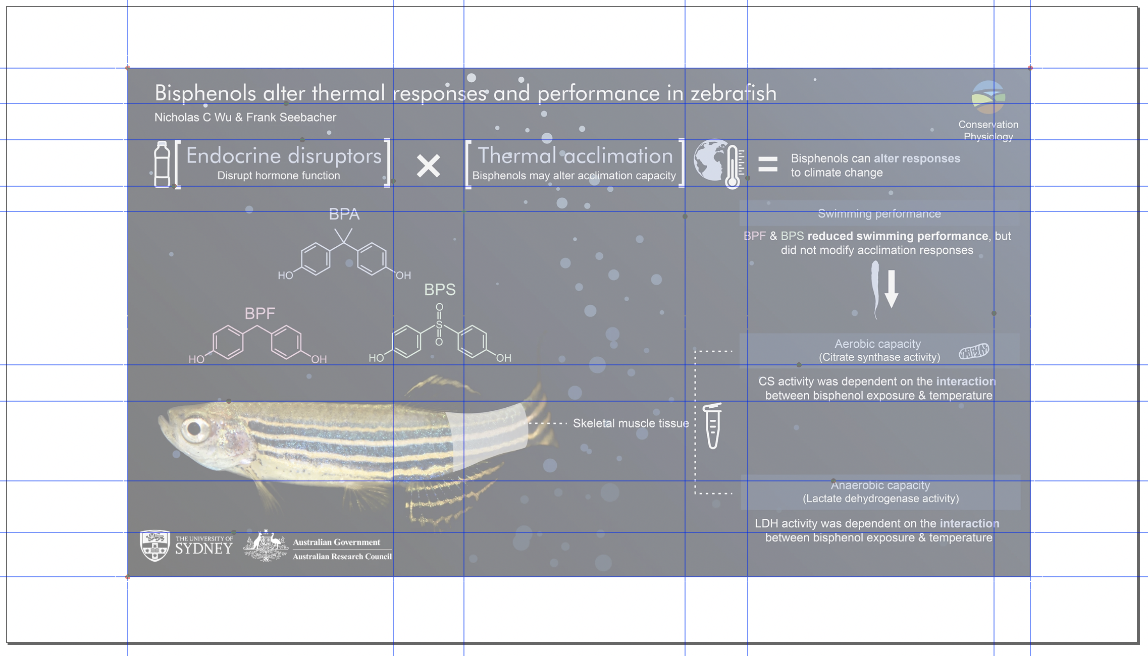
Alignment
Alignment helps your reader orient themselves and predict where information will be.
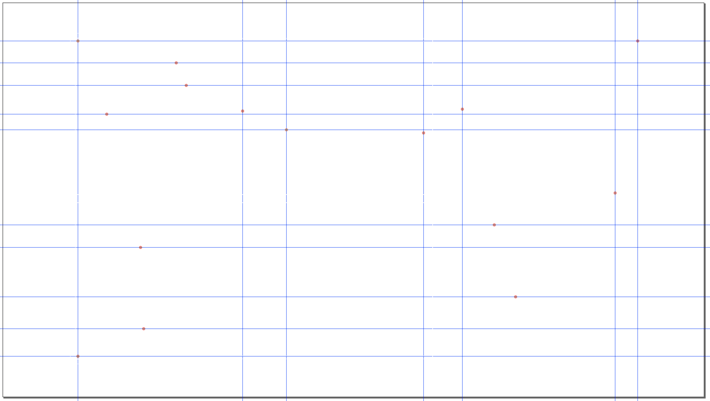
The grid has a dedicated following.
Space
This is the resting space around text and visuals. It gives the eye time to rest and move between salient points.
Also called negative space, or ground.
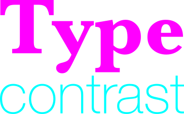
Contrast
This affects:
hierarchy
color
line
shape
type

Or….